THE ELEMENTS

Your second dosage of #Thirteen101: The ELEMENTS.

A few months ago, I posted about the 'Thirteen' of Thirteen Fit Apparel, why it's our name and how it ties into our brand concept. Today, I want to dive a little deeper into our message.

You may (or may not have) seen on our site, our OG design: The ELEMENTS Tee. This was one of our two original designs we launched when the website went live. So why did I call it ELEMENTS when it's a graphic of a rhino + some words?

Photo by Rebecca Brookstein Photography

Our overarching theme is Ultimate Self. We believe that achieving your Ultimate Self requires equal parts mental and physical *things* ...we call those things ELEMENTS. We have three ELEMENTS: Strength, Power, and Stability. It's all about mental AND physical strength, mental AND physical power, mental AND physical stability. 

So, going back to our OG shirt, The ELEMENTS Tee, this is a symbolic design for everything we stand for. I've always been extremely inspired by nature and animals, so when I was working on the brand concept and doing research, I came across information on animal symbology. The rhino was the perfect fit for what we believe in. There's no doubt the rhinos have all the ELEMENTS we stand for and what I like SO much about rhinos is that they are a docile creature by nature... but can become extremely aggressive if agitated or prompted. I just love that quality.

Photo by Rebecca Brookstein Photography

Taking this all one step further, we took our concept and directly (and I guess, literally) applied it to our tanks and tees. Each piece includes a label with one of the ELEMENTS. Either strength, power, or stability is seen on the exterior of your piece but when you flip it to the inside, it reads "from the inside - out," as a reminder that it's mental and physical. The hem labels are assigned at random so you don't know which one you're going to get--it's exciting, right?! 

Photo by Stephanie Garrido Photography

Photo by Rebecca Brookstein Photography

I'm going to be sharing a lot more about our concept in the coming weeks (teaser: look out for our Thirteen Journeys campaign... CAN'T WAIT) to apply everything I'm talking about to real stories, including my own. Without going into too much detail, this concept is really personal to me. When I got into fitness, I was mentally pretty weak and definitely physically weak. The stronger I become physically, the stronger I became mentally. And the stronger I become mentally, the stronger my body became. It's a cool thing. ANYWAYS, that's a story for later so stay tuned!

'Til next time,

Paige


Paige Festa
Read more
TEAM VELOX ROTA

TEAM VELOX ROTA

October of last year, I was manning our booth at an event up in Connecticut at the Mohegan Sun when Rachael popped in to say hello, at the time I didn't know her but we clicked and have been in touch ever since. Her friend was shopping around, she ended up getting our Pink STRONG LIKE RHINO Crop after some debate about which style to get. Rachael and I started chatting. First about how the pink shirt was for breast cancer... which turned into her telling me about how orange is the MS color. Then she mentioned that she was a cyclist and I was like, "uh, me too!!" ...except she actually rides outside for like, hundreds of miles. And all over the country. And to raise money for MS!

About a week later, I received a phone call and guess who?! RACHAEL! HEY GIRL! She then introduced (well, e-introduced) me to Michael. Long story short, we decided it would be really fun to work together on some team tees for her races and events.

Michael is the founder and Rachael is the Development Director + member of TVR, Team Velox Rota. They have been riding together (14 years now...but last year it was 13!). Our plan was to come up with 3 designs for 3 different events: Climb to the Top, MuckFest MS, and CCG a.k.a Cape Cod Getaway (the same event we made shirts for the National MS Society who runs that particular race--their biggest fundraiser of the year!).

  • We started with the Climb:

Their saying goes, "1200 Steps Closer To A Cure." So as you can see, we used their tagline as the focal point. I think it's pretty straightforward but I'm excited that we are going to reprint this design for this year's race, too!

Their team name for this event is the "Muck Dogs." As any event tee, we wanted to make sure to get everything in: team name, event name, year, and the team's logo. I think sometimes it's hard to achieve a modern design when there are a lot of required elements but I think we pulled it off!! It's a mud run so I think it's dirty enough but clean enough that it doesn't get lost.

  • Last and CERTAINLY not least (this one was a doozy!), CCG:

This year, TVR wanted to celebrate all the individuals who have participated on their team so the idea was to take all names (as you can see, there are hundreds) and incorporate them into the design. After a lot of editing, fixing names, moving names around, we finally came to this! The negative space is the team's logo. To achieve the negative space logo, we listed every name of every participant around the outside. We filled the inner circle with team hashtags, the event name, year, etc... #JUSTKEEPPEDALING

The design became the back of the shirt and because it's so detailed, we felt the front should be a little more minimal for the sake of balance. We did this design as a left-breast placement.

Designing last year's shirts was only the beginning; I'm posting about it now because we are revving up to start this year's designs and I'm getting PSYCHED about it! I love designing but it feels pretty damn good to do it with a cause.

'Til next time,

Paige

Paige Festa
Read more
THIRTEEN TURNS TWO

THIRTEEN TURNS TWO

11/13/15, the day our website went LIVE. I'm not great at math but I can tell you that's TWO. FULL. YEARS.

Normally, we post about custom design and design concepts on the blog but this month, I want to share our journey with you in celebration/recognition of our TWO YEAR ANNIVERSARY!

It's wild, really. I think it's crazy how things happen... how one experience or decision leads to the next and you look back to realize everything has changed.

Hi, I'm Paige.

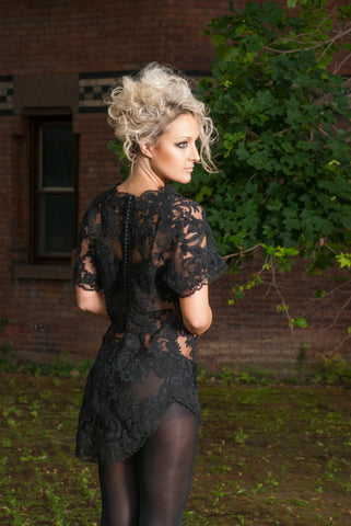
(Photo by Rebecca Brookstein Photography, @rebeccabrooksteinphotography)

I went to F.I.T. (the Fashion Institute, not to be confused with Florida) as a fashion design major specializing in eveningwear. I loved all things beaded, shiny and lacey. There was a program for activewear/sportswear at our school and I specifically remember thinking and verbalizing how I would NEVER want to design activewear. Never say never, as they say (Justin Beiber said it, too).

This was my senior collection... def not t-shirts

(Photographed by my schoolmate, Alicia King of @aliciakindphoto, aliciakingphotography.com)

When I graduated, my dream was to land a job in the luxury industry, designing gowns. About 6 months of being unemployed later (that's a little bit of an exaggeration because I did work, just not full time), a friend from school called me up and asked me to work for her as she was launching her own luxury collection. SO I SAID YES TO THE DRESS.

January 2013-September 2015 I was working my "dream job." But hey, things change. At the same time, I started getting really into fitness. Prior, I was FAR from fit. I exercised on rare occasion and ate HORRIBLY (like, bad. My diet almost exclusively consisted of PB&J, cheeze-its, chicken nuggets, no veggies in sight). Fast forward, it snowballed into me lifting weights, joining CrossFit, spinning and trying every way of eating I could (paleo, vegetarian, vegan, raw vegan, IIFYM, juicing and juice cleanses, etc...)

Fitness began to really change my life. I realized it was becoming more than just a hobby; it was becoming my lifestyle and this other passion which was extremely confusing to me. For my entire life, I pretty much knew what I wanted. I worked hard for it and all of a sudden, my feelings were shifting. In the midst of trying to cope with this confusion, I decided to get Spinning (TM) certified so I could get my foot in the fitness door while still maintaining my job in fashion.

Long story, still long but abbreviated, I started teaching spin and teaching more... and more until I slowly worked my way out of fashion. Phew, I did it. But a few months of full force fitness made me realize this is NOT who I am. At least, not totally. I AM creative and I NEED to design. The way I feel when I design is something I have a hard time putting into words but I'm going to try to: when something inspires me or an idea hits, I get a huge adrenaline rush... almost so much that I can't actually channel that energy into designing. I have to write it down or do research to try to focus it in, sit on it. Eventually, I'll find my way to the computer and when I'm IN the design, I lose track of time and I even forget to eat (that's a big deal because I really love food). I get physically high, I shake a little. I legit feel crazy but it's so exciting and overwhelming in the best way. So, being 100% fitness left me without that high.

Walking on the East River, NYC with my AMAZING friend, Gina (fitness professional and co-blogger of www.jetsetandforget.com) I was telling her how I was feeling, how I felt like maybe I should just make gym t-shirts (at this point, I had been building up my graphic design portfolio and resume for a few years on the side). She asked me, "Why don't you?" I responded, "I don't know." She asked again.... "So, why don't you?"

The next day (July 2015), I applied for the LLC, I decided on a company name, I designed the logo and I started working. At this point, I was preparing designs, ordering stock, designing the website and brand concept all for the launch Friday, November 13th, 2015.

For the first six months, I was figuring it out. Is this a hobby? Is this just a side project for now? Is this something I want to pursue? I really didn't know. It wasn't a priority in comparison to my paying jobs but it was something I was working on. 

(One of our OG designs, the ELEMENTS Tee)

That June, I made the move to be a vendor down in Florida (why Florida when I live in New York? I don't even know. I was just kinda like, let's do something crazy and shipping my entire stock down the coast was crazy to me!). I'm lucky to have friends and family who support me so much so I brought along with me my father and my cousin, Danielle to help man the booth of the 3-day event. At this point, I was in love with this brand and decided this was my priority. 

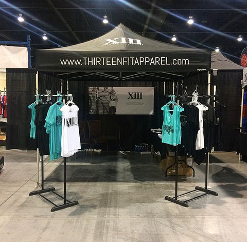
(At the Bacon Beatdown with Hard2Kill Athletics)

From then on, I started booking events, mostly in and around New York to avoid the travel expenses. It has surely been a learning experience; figuring out what events work for us and what our customers want (trial and error!).

In the past year and a half, I think the brand has really started to understand itself, its aesthetic and identity, and is more confident in its message. Sure, there are PLENTY of t-shirt companies. It's a competitive market but I'm a competitive person. I've had people allude to/straight up tell me how I've picked a bad market to be in because of how saturated it is, especially now when athleisure IS what people wear. But you know what I say?! BRING IT ON. I love competition, I thrive in chaos and hey, we've made it two years already!!

#DONTSETTLEFORSILVER
(Photos by Stephanie Garrido)

I'm certainly biased but I think we have a few things that help us stand out.
1. Our message, design and identity - everything we do has a reason, the details we include are put there on purpose to make sure the customer feels the message when they wear the apparel. Our designs have meaning and symbolism with a minimal, modern approach. We are more than t-shirts. We are a lifestyle, we are a mission! Read more about our concept by clicking HERE :) and to read more about the deets, click THIS

2. Custom design - we have our collection of tanks and tees but we absolutely go crazy for custom design. We've been so lucky to work with amazing brands, organizations, and individuals, bringing our quality and design aesthetic into their shirts (the MS Society, the National MS Society, Concrete Jungle Strength + Conditioning, Crouse NICU, FITWeek by Empowered, bachelorette parties, team shirts, event tees, just to name a few).

3. Customer service - coming from the luxury market and retail, I've definitely learned the value of making the customer's experience as easy and enjoyable as possible. Whether it's how we wrap orders with hand-written notes or following up with them to be sure their product is exactly what they wanted, we want to connect to our customers. At the end of the day, sure I own the company but we wouldn't be one if it weren't for the customers and community. I always tell people, once you purchase a shirt from Thirteen, you are a part of Team Thirteen. Without you, we've got nothin'.

Since our first anniversary SO much has happened. More custom design, more products added to the collection, more events, just MORE! Our newest not-shirt launch was our blog (that you're obviously reading), Thirteen Underground.

And what's in our future? Right now, we are working on a website revamp. It's time to level up!! New photos by Rebecca Brookenstein Photography are coming soon (@rebeccabrooksteinphotography), BUT THAT'S NOT ALL. New winter gear is coming in within the next few weeks AND we are in the development phase of our own leggings and joggers!! More events coming, more custom coming... we are certainly not slowing down.

*Raise your glass* or *cup of coffee* (because, Monday)... Here's to another year of growth, health, wealth and #ULTIMATESELF! Thank you to everyone who has made this brand possible... friends, family, customers, clients, community, readers, followers, TEAM THIRTEEN.

'Til next time,
Paige

Paige Festa
Read more
FLEX ON THE BEACH TEAM TEES

FLEX ON THE BEACH TEAM TEES

Flex On The Beach, an event run by Flex Events, was a reaaaaaal coooool (except really hot) experience for us this year. We hop around from fitness events as an apparel vendor but Flex is an event that hits close to home for us... like, literally.

This event was so special to us because 1. we got to connect with the fitness community of NY #home and 2. we had so many teams from Concrete Jungle Strength and Conditioning sporting the custom tees we did for them!

If you've followed our journey at all, you've probably caught onto our connection with Concrete Jungle... we do work with them ALL the time. The Jungle is where I found my love for fitness and it was basically the birthplace of Thirteen Fit. 

Prior to the launch of our website and first two designs, we did a custom project for the Jungle teams/competitors for a competition called Hail To The Queen. (I know, it sounds off topic but I promise it'll come full circle.) This was our first shot at a custom job, eek! After feeling pretty lost on a concept, I finally got a kick of inspiration. We ended up with this design:

I put a crown (Hail To The QUEEN) on a gorilla (because, Concrete Jungle); it's pretty straightforward but subtly included style from punk graphic design.

PHOTO CRED: Super Cleary

Fast forward to Flex On The Beach.

CONCEPT/MOOD

I worked with two ladies of the Jungle on this, Kelly and Vicky. We decided to bring back the gorilla from Hail To The Queen but change the scenery. The whole concept is pretty nostalgic; namely, because we brought back our gorilla from the first design we ever did together. 

The concept was to mix the feeling of retro-beach-vibes with punk-rock-graphic-design. Because the event was taking place on the beach (duh), we wanted to bring our gorilla to the beach so we spruced him up with some sunglasses, palm trees (which is certainly a stretch because Long Island, NY surely does not have tropical plants), and a pop of color in the back with the sun rays.

FINAL DESIGN

Details worth noting (I think):

  • To the left of the gorilla, you'll see the latitude and longitude of Long Beach. I just wanted to bring something into the design that was specific to the location without being so literal. This works because it falls in line with the beach theme.
  • "CONCRETE JUNGLE" looks torn and placed back together. This, along with the collage-esch, ransom-note-y look on the whole design, is reminiscent of the punk rock vibes we were going for.
  • The "Flex On The Beach" graffiti ties in with the punk rock elements BUT ALSO connects with the Concrete Jungle brand of being in the city/street art/underground.

Then, of course, the back: #UNREASONABLYSTRONG

Anddd here are just a few team shots ;)

Dasssss it!

'Til next time,
Paige

Need custom team tees? Email us at info@thirteenfitapparel.com for, you guessed it, MORE INFO!
Paige Festa
Read more
BRIDE-TO-BE CUSTOM TEE

BRIDE-TO-BE CUSTOM TEE

What I love about CUSTOM is that it's our opportunity to explore design outside of our brand identity and CONCEPT, AND it's a chance to make something meaningful for our clients.

Meet Hamutal and Amy. Hamutal was the bride-to-be (now, officially off the market!) and Amy is her new sister-in-law. We had the PLEEASSSUREEE of working with these ladies (though it was actually a secret/surprise for Hamutal) to create two designs in two mediums for the same event!

1. Bachelorette party shirts: worn by the bride and her party
2. Bachelorette party vinyl decals: applied to water bottles for the ladies at the party

PART 1: THE SHIRTS

Let's start with the shirt design! When Amy approached me to work on the design, she had a general concept figured out. The whole wedding theme was hippie-chic with metallic e'rrrthing. She sent over a bunch of inspiration: different designs with fonts she liked, color stories, design elements, shirt silhouettes, etc... the idea was to create a piece that would be wearable after the wedding, not something SO wedding specific that it limited the girls on when they could wear it after the party. We landed on a design centered around a Hamsa.

According to Google.com:

The Hamsa Hand is an ancient Middle Eastern amulet symbolizing the Hand of God. In all faiths it is a protective sign. It brings its owner happiness, luck, health, and good fortune. The hamsa hand has a wide variety of different spellings which includes hamesh, hamsa, chamsa, and khamsa.

Obviously, we weren't going to find some generic design and slap it on a shirt--we had to personalize it! So, here's the design we landed on... then I'll show you all the parts that make it unique for the lady of the hour.


THE BREAKDOWN

Let's start at the top... pretty straight forward, we did two hearts merging in the center #marriage

We wanted to include things that would be really personal and unique to their wedding. The wedding was on 8/20 so we abstracted the date and made it into a design detail (it only worked for the left side; the other side is a mirror image). See it?

Amy made it clear how important all the girls were to Hamutal and because this was the bachelorette party, we wanted to include them all! I actually learned a lot about these chicks without ever meeting them! As you can see, there are "chains" with little "gems" hanging from them on the bottom portion of the Hamsa. Each one has one of the girls' initials.

The flower in the center--you can't really miss it. Well, that's the same flower that was on their flower crowns (hippie-chic, remember?) that they wore for the party! The flower is surrounded by a triangle, as I was told Hamutal loves the shape. AND FINALLY, you'll see Hamutal's new initials in each corner of the triangle (HGL).

We ended with two versions: black with gold for the bridal party and white with gold for the bride! Here's the finished design + some photos of the ladies lookin' fiiiiiine.

THE BRIDE, HERSELF

PART 2: THE DECALS

I'll keep this portion to the point. We made decals.

Because placing decals on something like a water bottle can be delicate, we had to minimize the design so it could withstand being handled and washed. The final artwork ended on being the "Good Vibe Tribe" part of the shirt design + a decorative border. And here it is:

A big THANK YOU to Amy for working with me on this project and for always sending photo updates! It's always soooooo exxciting to see custom work to come to life!

'Til next time,

Paige

Interested in getting yo' custom on? Email us at info@thirteenfitapparel.com. WE. LOVE. CUSTOM.

Paige Festa
Read more
CAPE COD GETAWAY CUSTOM TEES

CAPE COD GETAWAY CUSTOM TEES

We are still basking in the HONOR of working with the National MS Society, BikeMS on their biggest race of the year -- the Cape Cod Getaway!

Let's put this all in context... from the National MS Society website:

Multiple sclerosis is a chronic, unpredictable disease of the central nervous system (CNS), which is made up of the brain, spinal cord and optic nerves. It is thought to be an immune-mediated disorder, in which the immune system incorrectly attacks healthy tissue in the CNS.

To put the NMSS simply, it's an incredible society dedicated to freeing the world of Multiple Sclerosis.

And BikeMS, what's that?

Bike MS is the fundraising cycling series of the National MS Society and raises more money than any other cycling event for any other cause. To date, Bike MS cyclists, volunteers, and donors have raised more than $1 billion so people affected by MS can live their best lives as we stop MS in its tracks, restore what's been lost and, end MS forever.

So... BikeMS put on this HUGE event where cyclists rode 150 miles from Boston to the top of Cape Cod in two days to raise money for the cause!

Let's get into the design.

MOOD

CONCEPT

There were a few details that I KNEW I wanted to incorporate: bold lines and a pop color. My initial focus was to create something that was a little more modern and different than your standard giveaway tee. As of recent, I've been crazy inspired by line-work. What I love about it so much is that when the design is not "filled" with color, it leaves so much room for your eyes to just enjoy the space and shapes--and there is nothing I love more than white space. It's open and fresh.

The concept we came up is layered; it's pretty literal but I always like to have something a little deeper, ya know?

A map of the event. Wow. How much more literal can it get?! But haven't you heard? It's all about the journey. For those who suffer from MS, for those who have loved ones who suffer(ed), for those who have survived, and for those who spend countless, SELFLESS hours and miles helping, they all have a significant journey. THAT'S what this design is all about.

This was the first go:

I landed on a map of just the Cape, turned into lines and lines and lines. It was a great gateway into what happened next. When I spoke with the NMSS, we decided to include more of Massachusettes (so we could also see Boston since that's where the race starts!). 

FINAL

THEN the real maaagic started really happening! Once we had the whole area mapped out, we highlighted the route they rode (all 150 miles!) from Boston to the top of the Cape. Of course, we used orange because that's the MS color... and having the white + orange pop on a deep navy... SO. CRISP.

And I mean, what's a BikeMS shirt without a bike? ZOOM ZOOM

To add to the fun, we did the neck badges for the event so the designs stayed cohesive.


Lastly, here's the printed design. We couldn't be happier with the result :)

'Til next time,

Paige

P.S. We ADORE custom. Looking for a design for your own event? Shoot us an email at info@thirteenfitapparel.com:)

Paige Festa
Read more
THE THIRTEEN OF THIRTEEN FIT APPAREL

THE THIRTEEN OF THIRTEEN FIT APPAREL

I'm asked on the reg, "Why is it THIRTEEN Fit Apparel?"

Here's your first dosage of #Thirteen101.

I've done small posts on social media to explain it but seeing as though today is the 13th AND more specifically, it's the 13th that sparked the brand name (wink, wink... it's my birthday), I'm going to go into a little more depth about our concept!

Fact: I was born on Friday the 13th
Myth: Friday the 13th is bad luck

You know when it's your first day in class or first day with a new group of people and they have you go around the room, "Tell us your name and one interesting fact about yourself." Well, this was ALWAYS my go-to (that, and I have a phobia of ketchup, also known as saltomaphobia).

Me: Hi, I'm Paige Festa... yes, like 'fiesta' without the 'i' and yes, it does mean party. And, uhmm... I was born on Friday the 13th.
Not Me: Oh, that's bad luck
Me: No, my mom told me it was good luck!

Moms are always right (THANKS, MOM). Luck, an interesting concept. By definition:

good fortune; advantage or success, considered as the result of chance rather than through one's own actions

We challenge that. In reality, luck starts out as just an idea, whether it's a good-luck charm, lucky number, or ritual. The believer believes in this idea so strongly that they manifest it into reality. We control our own luck, right? That means we realllllly aren't leaving it to chance. To me, 13 is my lucky number and it literally pops up in my life ALL. THE. TIME. and it's like, uncanny. The way I see it, I believe in it so much, the universe knows it and responds to it.

Of course, 13 is super personal to me but the brand really isn't about me and my experience. It's about YOU translating the concept to YOUR experience(s).

It's not groundbreaking... but your mind and body are connected. Fitness -- and really, life in general -- is a balancing act between the physical and mental. Sometimes, your body can do it and you need to convince your mind. Sometimes, your mind is like, "HELL YEA" so your body follows suit.

Read more by checking out our CONCEPT page on the site (click here)

Believe it, achieve it.
Mind over matter.
You can do it.
You are so much stronger than you think.
When there's a will, there's a way.
You get the gist... all those cliches apply here.

AND THAT MY FRIENDS, IS WHY WE ARE THIRTEEN FIT APPAREL.

Next up for #Thirteen101: The ELEMENTS.

'Til then,

Paige
P.S. Thirteen Fit Apparel was launched on Friday the 13th (11.13.15) and these were our first logo styles:

(click photos to shop our OG tanks and tees... but no pressure or anything)


Paige Festa
Read more
CORPORATE CHALLENGE CUSTOM TEES

CORPORATE CHALLENGE CUSTOM TEES

So, every year, J.P. Morgan Chase and Co. put on what they call the J.P Morgan Corporate Challenge. This is a 3.5mile race celebrating teamwork and community. Interestingly enough, here's their history:

On the night of July 13th, 1977 in Central Park, a total of 200 runners from 50 companies entered an event called the Manufacturers Hanover Corporate Challenge, named for one of J.P. Morgan's predecessor firms.

CAN WE TALK ABOUT HOW IT STARTED JULY 13th?! FYI: The whole reason we are THIRTEEN Fit Apparel is because 13 is my lucky number.... BECAUSE I WAS BORN ON FRIDAY THE 13th, July the 13th. WHAT.

Not to mention, the event takes place in 13 different cities.

Anyways... last year we were lucky enough to work with York Capital on their Corporate Challenge team t-shirts and this year, we were even luckier! Round 2!

Let's jump right into design. This year, York wanted to play with the concept "York State of Mind." Here's what we came up with.

It's pretty straight forward. The concept plays on the company name, "York." The idea is reminiscent of the classic song, "New York, New York" by Frank Sinatra so I wanted something about the design to feel classic but at the same time, something visually urban to keep it modern. Since we are keeping in the musical theme, the design visually connects the classic Frank with urban Jay-Z by using fonts that relate to both time periods and feelings.

I'm the new Sinatra, and since I made it here
I can make it anywhere

-Jay-Z

And here's the back.

Then, they raced!

Paige Festa
Read more
13U APPAREL

13U APPAREL

Thirteen Fit APPAREL - you didn't think we'd launch a blog and not use it as an excuse for new shirts, did you?!

This branch of the brand was really exciting for me, design wise, because it was a chance to reach outside of the more clean-line, minimal design work I've done in the past. This was my chance to get a little dirtier (but not totally... I'm a sucker for clean lines).

I wanted to stick with the 13U logo but wanted to do something slightly more interesting than slapping the logo plain on a tee. Two concepts emerged: one as the logo, as is (but you'll see a little zest with the concept) and the second as a more abstract-ish take on the logo.

MOOD

CONCEPT 1

Let's start with idea #1: the logo. Remember the ol' riddle: what's black and white and re(a)d all over? I distinctly recall my sister giving me this riddle when my age was likely in the single digits. I had NO idea and even when she told me the solution was a newspaper, I didn't understand it. I guess at that time I didn't understand puns. Well, here's my solution to that riddle - 13U in black with RED. Get it?! Hey, maybe the blog isn't quite paper news but you catch my drift!

CLICK TO SHOP 13U LOGO TEE

Recently, I've been really into square designs. For this one, 13U is in a square which mimics the square around our STRONG LIKE RHINO design... and as a side note, I've definitely used some squares in recent custom work, too! No good reason except the square just feels so good. ;)

CONCEPT 2

And idea #2: the maze. Say wuuuuut?! I'm going to bullet this concept because otherwise, I'll get carried away with too many words

  • 13U logo turned into a "maze," more or less
  • Gold path through the maze
  • Gold path = journey to your #UltimateSelf... that being your #1 you, your best you
  • If you followed our BLACK+GOLD Series, you know that at Thirteen Fit, we #DontSettleForSilver
  • Maze starts on the bottom right, near "UNDERGROUND"
  • Maze ends on the top left, near the "1"
  • So, the maze is taking you from the bottom to the top, to #1, in gold, get it?

CLICK TO SHOP 13U MAZE TEE

CLICK TO SHOP 13U MAZE LADIES CROP RACERBACK


Paige Festa
Read more
ROW24 EVENT + TEES

ROW24 EVENT + TEES

Charity is really cool. It's even cooler when you do it with cool people.

This past weekend (June 3-4), Concrete Jungle Strength and Conditioning (Upper East Side, NYC) hosted a 24-hour row-a-thon, A.K.A. #Row24, for the Manhattan Children's Center to raise money for autism. Thirteen Fit Apparel (hey, that's us!) feel so honored to have collaborated on the event.

There are a few reasons this event hit home for me:
1. As previously mentioned, charity is cool. With so much negativity in the world, it's nice to be a part of the good!
2. My cousin is a behavioral analyst (and a damn good one at that) who works with and teaches autistic children. She's one of my best friends so I'd say I'm passionate by association.
3. It was being hosted by my home gym with our fitness community.
4. Fitness (obsessed) + Design (it's what I do) + Charity (cool) = no brainer.

Before I dive into design stuff, shout out to all who were involved with organizing the event! It was awesome being a part of the Row24 team along with Concrete Jungle members/staff Ian, Stu and Brad along with MCC's Ellaine and Amanda!

Together, we rowed of 500,000 meters and raised OVER $30,000 for the MCC! Because no one can speak to the cause better than the MCC, here's a little blurb from their website:

This program’s transdisciplinary model incorporates ABA, speech and language therapy, occupational therapy, as well as sensory integration, natural environment training and family support. Manhattan Childrens Center provides a comprehensive educational approach for children with autism spectrum disorder utilizing scientific research-based interventions that are effective based on years of experience.

Ok-let's talk design THEN we can get to the photos!

The concept was to design something reminiscent of an old-school college rowing crew tee but with a modern twist. The design is pretty straightforward: we've got the NYC skyline with a sun peeking through that can be viewed as both the sunrise and sunset... this carries right into the next portion which is the large 24 in the background. WE ROWED FOR 24 STRAIGHT HOURS!! Sunrise. Sunset. 24 hours. Yea?
Then we had to introduce the rowing portion. Though we weren't out on the water, I wanted to use the oars to keep with the rowing crew idea (and it's just aesthetically a nicer and more minimal design element rather than illustrating a Concept2 indoor rower). I used the term "crew" to group the community together as a team, a rowing team... the crew!
LASTLY, I added a crown to the "ROW24" - the crown from the Concrete Jungle logo to tie it all together!

Here's the front:
For my fashion folks, remember back in like, 2008 when Jacobs by Marc Jacobs tote bags were SUPER in style? The bags went on and on like:

Image result for jacobs by marc jacobs canvas tote

They've got a sense of humor and are really aggressive... I like that. We had so many things to say on the back so might as well go all out! So, here's our version:

Last thing before we get to the event photos! COLOR. Blue is the color for autism awareness.... so blue is what we did.

PHOTOS COURTOUSY of  JEWEL SALES PHOTOGRAPHY. Check her out - she's a gem (see what I did there?)

(pssst.... we designed this one, too!)
A BIG THANK YOU TO ALL OF OUR DONORS:
(click below donors to check out their websites!)

 R Bar Energy | Wilde Brands | Fiji Water | Essentia Water | Dig Inn | Kobeyaki | Parlor Steak and Fish | Europan Cafe | Google | Anheuser Busch | Chef's Cut Jerky | Deliciously Fit | Rathbones | Arctic Zero

Paige Festa
Read more
13U IDENTITY DEVELOPMENT

13U IDENTITY DEVELOPMENT

When we decided to launch the blog for Thirteen, the initial objective was to improve the SEO (search engine optimization) and generate more visits to the website. But what the heck were we going to write about?! We simply just wanted more words on the website in hopes to attract more friends.

Our custom projects are HUGE to the company but we haven’t had much of a platform to really display the work we do. There is a “CUSTOM” page on the website but to be honest, it’s pretty bland and certainly does NOT give you a feel for all the design fun we have behind our designs/tees. This has been plaguing me for a while because I want to show off all of our projects and collabs!

Then the lightbulb went off. What a better way to talk about our creative work than to do a running blog of past, present and future projects?! HELLO, THIRTEEN UNDERGROUND.

So because now this idea has grown into something that weighs a little heavier than just a blog, we wanted to make it a big to-do! Branding, logo, launch, apparel, the whole sha-bang.

First thing’s first: branding and a new logo… something that represents the blog as an independent platform but still connected to Thirteen brand.

Underground: buzz words like graffiti, subway, street art, gritty, dark were coming to mind. I wanted a vibe that was little more rebellious and dirty than the clean, minimalism of Thirteen Fit Apparel’s designs.

If you follow us on social media (Instagram facebook), you’ve probably seen all the new inspiration we’ve been posting. THAT’S what I want Thirteen Underground to embody. 

MOOD/FEEEEELSS

For me, creating mood boards is how I get my mind organized to design for whatever project it is that I'm working on. It's easy to skip this part of the design process because of deadlines but I've learned over the last few months that this portion is absolutely crucial for me in order to come up with a successful design. Why? When I sit down to work on a project, I need direction ESPECIALLY when I don't have a client who has a clear vision of what they'd like. Design is so much about feeeeeelings and the mood board is where you put those feelings into an organized visual. 

BECAUSE I'M A FONT SNOB...

As previously mentioned, in launching the blog I wanted it to have its own identity, independent from our apparel BUT it still needed to sit with the brand because they are under the same umbrella. To me, this means carrying over certain design elements that the brand already has but then adding to that. Above, you see I pulled the fonts from our logo and Strong Like Rhino design. These two fonts are heavily used throughout our branding but for 13U, I wanted to manipulate them while keeping their integrity and connection to the apparel line.

MAKE IT DIRTY

And here's just the tail end of the development phase (I went through MANY combos before narrowing it down to these few). The challenge was to find a balance between the clean lines and minimalism I like to keep consistent with the apparel but then introduce the "gritty" part. 

FINAL

Up Next: 13U APPAREL DESIGN DEVELOPMENT! Legit FIRED UP to share this part with you... concepts + design + apparel *heart eye emoji*

'til then,
Paige

Paige Festa
Read more
DRUM ROLL, PLEASE...

DRUM ROLL, PLEASE...

It all started when I texted my sister, “Hey, I need a blog name.” At that moment, I was heading down the stairs to the e60th Flywheel Stadium Cycling studio to teach my 5:30pm class. Because the studio is basement level, I lost service for the time I was down there. When I came back above ground to head home, I received a bunch of rapid-fire texts from Meghan (my sister, previously mentioned), one being a sarcastic comment on how I wasn’t responding promptly enough…

so in response I said, “sorry, I was underground.”
and Meghan said, “Thirteen Underground.”
then I was like, “Oh my gawd, I’m obsessed.”


Concept: Thirteen Underground is here to keep you up to date on what’s happening here at Studio Thirteen (ironically on the 5th floor of the building). Underground is really just behind-the-scenes, in a different direction. And doesn’t it just sound cool? Underground. New York City. Taking the subway. Graffiti. It’s gritty, New York-y, and it’s a little bit sexy.

The idea is to share with whoever will listen (or in this case, read) what this company is all about, from concepts to final products. Here, I want to tell you about collaborations, events, custom projects and inspiration—the stuff that I can’t really jam into an Instagram post or website page.

Being a designer and fitness professional, sometimes I get confused (for lack of a better word) on which to love more; what’s great is that Thirteen Fit Apparel allows me to feed both passions without fear of neglecting one or the other; THIS is where I get to tell you about ALL OF IT.

Up next: a breakdown of the inspiration, concept, mood and development of THIRTEEN UNDERGROUND and it’s branding [insert party emoji].

‘til then,
Paige

Paige Festa
Read more
61 results
Left Continue shopping
Your Order

You have no items in your cart

Liquid error (layout/theme line 88): Could not find asset snippets/spurit_uev-theme-snippet.liquid